Creative Photography
I recently picked up the book “Creative Photography” by Franco Fontana. In this book the author describes some exercises to get a better understanding of color. The first, called the “red exercis”, consists in taking photos whose main subject is the color red.
It sounds easy enough but how to know if you’re doing the exercise correctly? You should answer a simple question: does the photo loose its power if the color red is removed from it? If the answer is yes then the photo hit the nail on the head.
The author suggests to take the camera, go out and shoot around 25/30 images that have red as the main subject. And that’s exactly what I did.
After a few warm up shots I started really enjoying the process of looking for red everywhere in places and objects that would normally go unnoticed. I didn’t feel to different from a treasure hunt of some sorts.
Given the nature of the exercise I decided to set my aperture to f8 and stick to it. This forced me to rely on color itself and not bokeh to make the red stand out in the photos.
The first photo I was very pleased with was the exit of a narrow garage. The red of the sign really stands out from the general grey of the rest of the frame and the white arrow provides an interesting perspective.

Exit - f8, 1/80, ISO 200
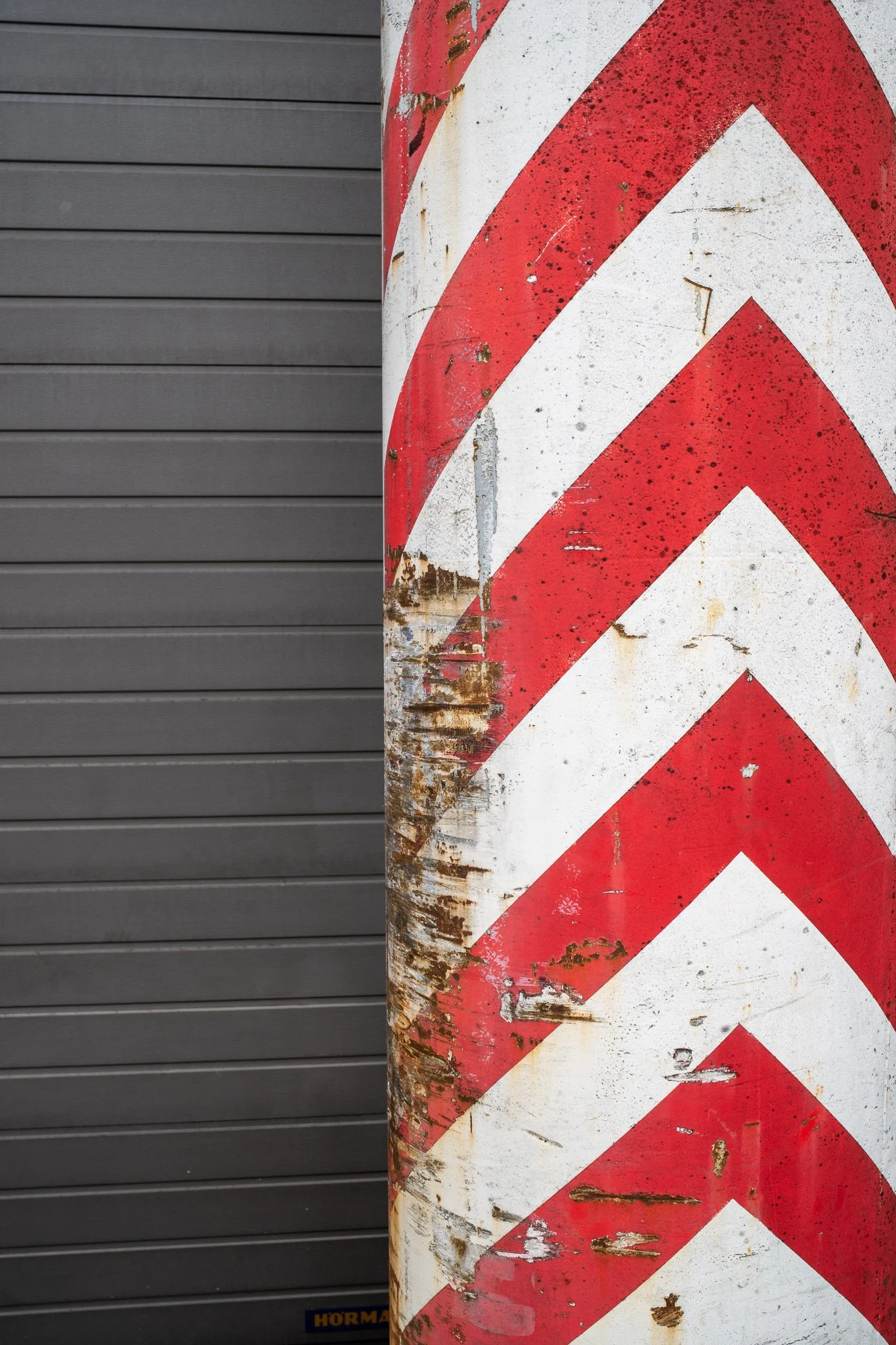
As I kept walking I came across a pole with some red arrows and snapped a photo.
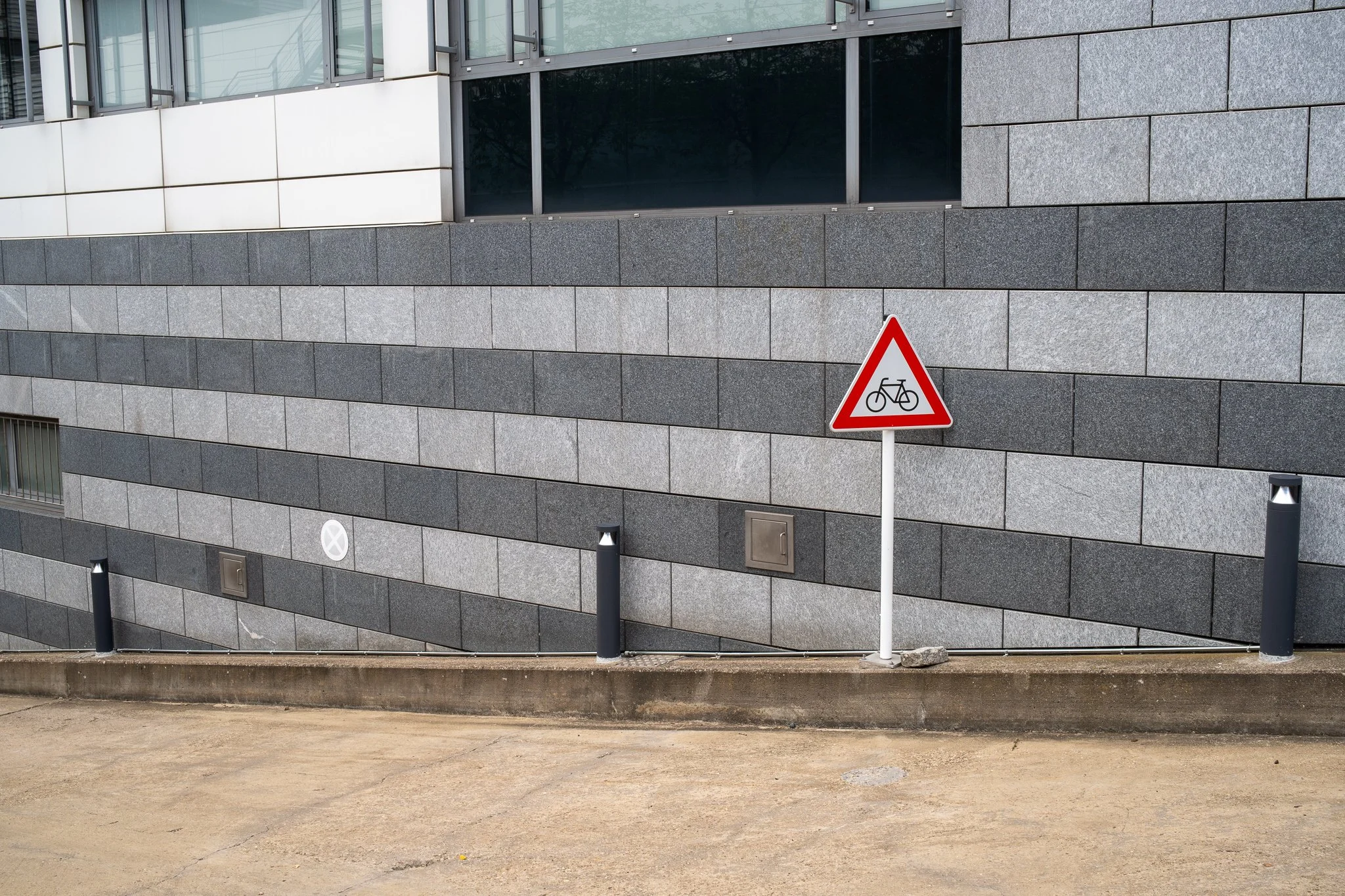
Street signs were one of the main sources of red I came across during my walk and this bike sign is another good example for this exercise.
The other two common red objects I found were flowers and cars.


I also found a can of red Fanta on the grass that caught my attention. Even though the composition is not super creative, the contrast with the green works well here.

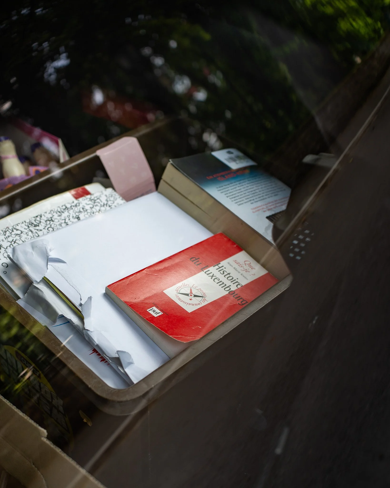
The only picture I took with a wide aperture because of low light turned out to probably be one of the best of the day. I saw a box of books on the back seat of a car parked in a narrow street. I immediately noticed the red book on the top of the box and took a photo through the back windows with some reflections of the trees above the car.
Another good example is a van parked in a square. The back windows is read, the rear lights are red, the side stripe is read, the flowers on the window are red and there is no other distracting color.

As I was finishing my shoot I walked by one of the main bridges within Luxembourg City. As it so happens this bridge is … red! I tried a few different compositions and these are the ones I like the most.


If I didn’t explicitly mentioned my intention to focus on the color red would you have guessed it that that was the common thread among just by looking at the pictures? If the answer is yes than I think I did a good job.
Probably the best part of this exercises is that it gives a clear direction to a photowalk without being excessively restrictive. I felt free to explore and I took pictures that I would not have considered otherwise. And this brings us to the topic of framing realities. A random scene or object suddenly becomes meaningful because it’s part of a bigger goal. And a picture that makes little sense by itself becomes compelling when part of a cohesive collection with a common intention.